EnjoytechlifeEnjoytechlife
  • Home
  • AI
  • Apps
  • Excel
  • Gadget
  • Software
  • Space
  • Word
Facebook Twitter Instagram
  • Privacy Policy
  • Contact Us
  • Sitemap
Facebook Twitter Instagram
EnjoytechlifeEnjoytechlife
  • Home
  • AI

    Removing Life Events on Facebook: A Step-by-Step Guide

    May 4, 2024

    Winning Charms: Unlocking the Mystery of Online Gamers Lucky Rituals

    April 18, 2024

    ทำไมจึงควรเลือกทะเบียนรถจากเว็บออนไลน์ในยุคนี้

    April 9, 2024

    DUNIA303: Tempat Perlindungan Anda bagi Pecinta Slot Online

    March 20, 2024

    Is Each Spin On Megaways Game Unique?

    March 1, 2024
  • Apps

    Cash Advance Apps That Don’t Use Plaid: A Comprehensive Guide

    December 3, 2023

    How to Block Apps on iPhone: A Comprehensive Guide to App Restriction

    December 3, 2023

    Selling Feet Pics Apps: A Comprehensive Guide to Monetizing Your Foot Fetish

    December 3, 2023
  • Excel

    Create Excel Legend Order Not Changing Its Original Copy

    January 28, 2023

    Learn Why Your Microsoft Excel Not Sorting All Columns Duly

    January 3, 2023

    How To Center a Cell Horizontally in Excel

    November 14, 2022

    How To Assign A Value To A Variable In Excel

    November 13, 2022

    How To Shorten Excel Sheet

    November 12, 2022
  • Gadget

    Leasing a MacBook Pro 16″: A Comprehensive Guide

    August 27, 2024

    Exploring Different Safety Mat Types

    August 7, 2024

    Unraveling the Mystery of Dr. Claw in Inspector Gadget: A Comprehensive Exploration

    December 3, 2023
  • Software

    Streamline Your Workforce with the Best Shift Management Software

    April 21, 2025

    Engineering Software in Education: 9 Benefits for Students and Educators

    March 27, 2024

    How Can a CRM Add Value to Your Organization

    March 25, 2024

    Best Practices in AI Software Development: Your Guide to Success with a Custom Software Development Company

    March 15, 2024

    Is SAS Faster Than SSD?

    February 13, 2024
  • Space

    Unveiling the Enchantment: Explore the Wonders of the Museum of Dream Space

    December 3, 2023

    Plan 9 from Outer Space: Unraveling the Mystery of the Cult Classic

    December 3, 2023

    Trials in Tainted Space Wiki: Unraveling the Galactic Adventures

    December 3, 2023

    Power Rangers in Space: Exploring the Galactic Adventures of the Legendary Heroes

    December 3, 2023
  • Word

    How to Split Pages in Word into Separate Files

    June 20, 2023

    How do I Delete a page in Word that won’t Delete Mac

    May 28, 2023

    How To Get Rid Of Footer In Word

    April 23, 2023

    How to Merge Multiple Pages into One Page in Word? A Complete Guide

    January 2, 2023

    How To Print Gridlines in Word

    December 7, 2022
EnjoytechlifeEnjoytechlife
Home»All»Mastering Data Visualization: Creating Heat Maps in Excel
All

Mastering Data Visualization: Creating Heat Maps in Excel

By RodneyMay 25, 20244 Mins Read
Facebook Twitter LinkedIn Telegram Pinterest Tumblr Reddit Email
Share
Facebook Twitter LinkedIn Pinterest Email

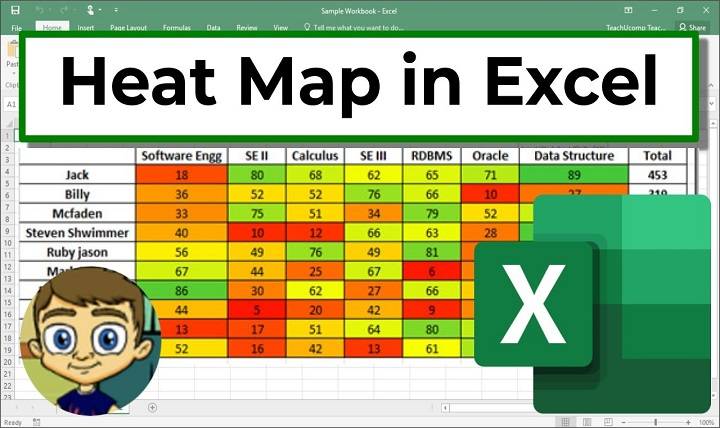
In the realm of data analysis and visualization, heat maps serve as powerful tools for representing complex data sets in a visually intuitive and insightful manner. Microsoft Excel, as a versatile spreadsheet software, offers robust features for creating heat maps that enable users to identify patterns, trends, and relationships within their data. In this comprehensive guide, we’ll explore the methods, techniques, and best practices for creating heat maps in Excel, empowering users to unlock new insights and make informed decisions based on their data.

Understanding the Significance of Heat Maps in Data Analysis

Visual Representation:

  • Heat maps provide a visual representation of data using color gradients to depict variations in values across different categories, variables, or dimensions.

Pattern Recognition:

  • Heat maps facilitate pattern recognition and trend identification within data sets, enabling users to quickly discern areas of high or low concentration, intensity, or correlation.

Data Comparison:

  • Heat maps allow for easy comparison of multiple data points or variables, making it simple to identify outliers, anomalies, or areas of interest within the data.

Methods for Creating Heat Maps in Excel

Conditional Formatting:

  • Utilize Excel’s conditional formatting feature to apply color scales or gradient fills to cells based on their numerical values, creating a basic heat map visualization directly within the spreadsheet.

Color-Coded Cells:

  • Manually assign colors to cells based on predefined thresholds or criteria, using formulas or custom formatting rules to dynamically update the heat map as data changes.

Charting Tools:

  • Use Excel’s charting tools, such as the “Map Chart” or “Bubble Chart,” to create more advanced heat map visualizations that offer additional customization options and interactivity.

Practical Applications of Heat Maps in Excel

Sales Performance Analysis:

  • Visualize sales data across regions or time periods using a heat map to identify areas of strong performance or potential growth opportunities.

Risk Assessment:

  • Assess risk levels within a portfolio or project by creating a heat map of key risk indicators, allowing stakeholders to prioritize mitigation efforts accordingly.

Customer Segmentation:

  • Segment customers based on demographic or behavioral data using a heat map to identify clusters or patterns that can inform targeted marketing strategies.

Best Practices for Creating Heat Maps in Excel

Data Preparation:

  • Ensure data is clean, organized, and formatted correctly before creating a heat map to ensure accurate and meaningful visualizations.

Color Selection:

  • Choose a color palette that is intuitive, accessible, and easy to interpret, avoiding overly bright or saturated colors that may distract from the data.

Labeling and Legend:

  • Provide clear labeling and a legend to help users interpret the heat map and understand the meaning behind the colors used to represent different values.

Advanced Techniques for Heat Map Creation in Excel

Dynamic Range Selection:

  • Use dynamic range selection techniques, such as named ranges or structured references, to automatically update the heat map as new data is added or existing data changes.

Interactivity:

  • Incorporate interactive features into the heat map, such as tooltips or drill-down capabilities, to allow users to explore the data in more detail and uncover hidden insights.

Heat Map Excel

Explore advanced chart customization options, such as adding data labels, trendlines, or annotations, to enhance the clarity and effectiveness of the heat map visualization.

Related Post:

How To Disconnect Someone From Discord Call

How To Find Random Friends On Discord

How to Leave a Discord Server Without Anyone Knowing

In the dynamic landscape of data analysis and visualization, heat maps offer a powerful and versatile tool for gaining insights, identifying trends, and making informed decisions based on data. By mastering the methods, techniques, and best practices outlined in this guide, users can leverage Excel’s capabilities to create compelling and informative heat map visualizations that unlock new insights and drive actionable outcomes. Whether analyzing sales performance, assessing risk, or segmenting customers, the strategic use of heat maps empowers users to extract value from their data and make data-driven decisions with confidence and clarity. Embrace the power of heat maps in Excel, and embark on a journey of enhanced data analysis and visualization in your professional and personal endeavors.

Share. Facebook Twitter Pinterest LinkedIn Tumblr Email
Previous ArticleSeamless Integration: Inserting PDFs into PowerPoint Presentations
Next Article Unlocking Advanced Data Lookup: Mastering Nested VLOOKUP in Excel
Rodney

Hi, I'm Rodney—tech enthusiast, gadget lover and the voice behind EnjoyTechLife.com. I break down complex tech into simple, actionable tips so you can get the most out of your digital life. Let's explore the future, one post at a time.

Related Posts

Pincoins and internal currency: how profitable is the bonus system

August 3, 2025

How to Transfer Contacts from Android to iPhone (Without Losing Your Mind)

June 1, 2025

The Shortcut to Not Paying Capital Gains Tax on Inherited Property

March 4, 2025

The Shortcut to Cleaning a Recorder

March 4, 2025

The Hack to Oven-Cooking Tater Tots

March 4, 2025

The Shortcut to Divorcing Someone

March 4, 2025
Popular Now

The Role Of Forensic Accountants In High Asset Divorce Cases

October 9, 2025

How to Protect Your Grand Blanc Home from Probate

October 9, 2025

The Best Profile Picture Maker Apps for Android and iPhone

October 7, 2025

What To Do If You Are Arrested In Dallas For The First Time

October 7, 2025

Understanding Comparative Negligence In Nevada Car Accident Cases

October 7, 2025
About Us

Enjoytechlife is a technology blog. I am passionate with technology for this reason start this blog to share my view and knowledge with people who are interested in tech. Enjoytechlife!

For Any Inquiries

Contact : [email protected]

Top Picks
Law

The Role Of Forensic Accountants In High Asset Divorce Cases

By RodneyOctober 9, 2025
Follow Us
  • Facebook
  • Twitter
  • Pinterest
  • Instagram
  • YouTube
  • LinkedIn
Facebook Twitter Instagram Pinterest
  • Privacy Policy
  • Contact Us
  • Sitemap
Enjoytechlife.com © 2025 All Right Reserved

Type above and press Enter to search. Press Esc to cancel.